Here in North Carolina, a hurricane recently moved very slowly across our state, causing major flooding, and even closing miles of interstate highways for longer than a week. There is data available online for gauges along the river (or gages, as they call them), but I doubt many people know the exact location of the rivers/cities/landmarks in the gage descriptions. Therefore I thought I'd create some maps & graphs to provide an easy and intuitive way to view the data...
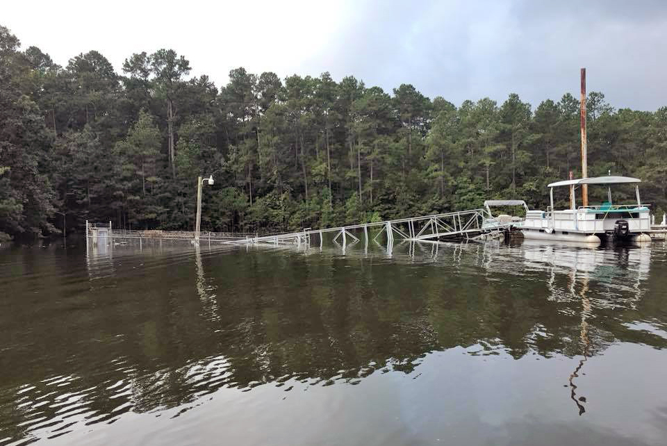
Before we get started, here's a picture from my buddies Paula & Craig showing the flooding at the marina on Jordan Lake. In the left side of the photo (underwater) is the entrance gate to enter the marina dock. The dock floats, and the ramp is usually sloping downwards - but now it is sloping upwards (with the water level around 16 feet above normal). Also, here's a link to some video footage of the marina before and after the flood.
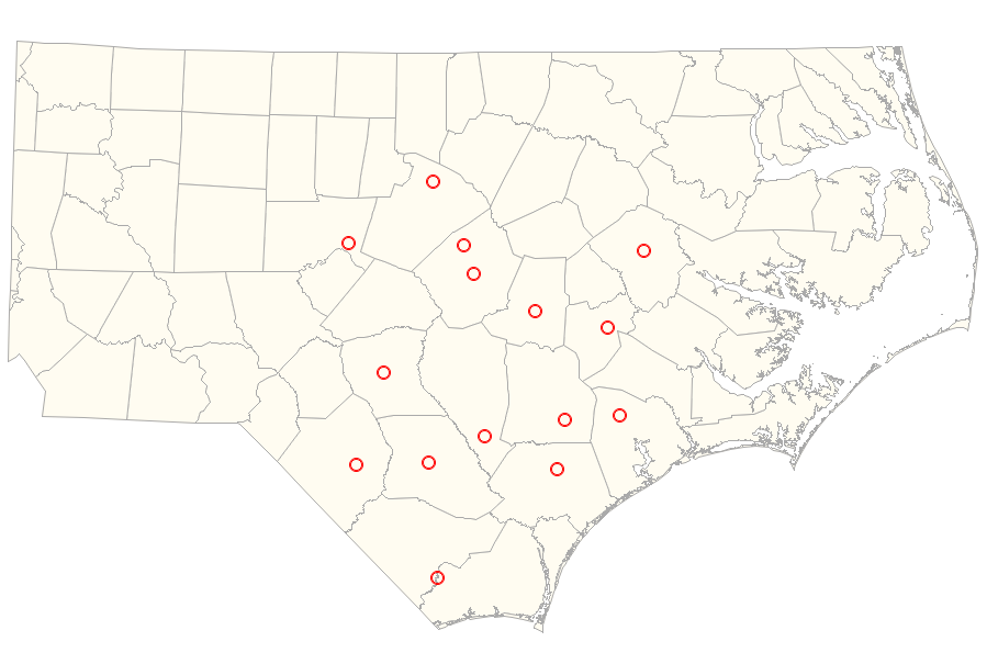
Now, let's analyze that flood data! First, I selected 15 river & lake level gages along the eastern 1/2 of North Carolina, and created a dataset containing the latitude, longitude, and several other bits of information about them. I then plotted the gage locations on a North Carolina county map.
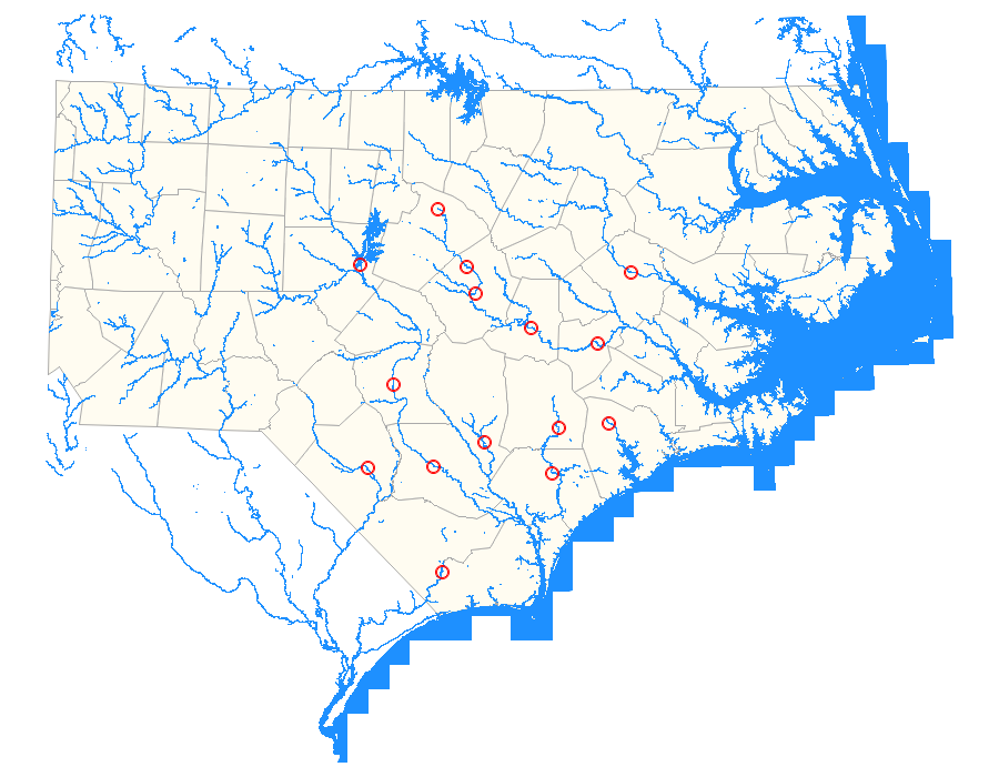
Seeing the gages on a map was a lot more intuitive than seeing the latitude/longitudes in a table, but I still needed more points-of-reference to help me get my brain around this data. Therefore I downloaded a shapefile containing some of the larger rivers and lakes, and added those to the map. You might assume I annotated the rivers onto the map, but I actually used the polygons (rather than lines), and combined these 'water polygons' with the county map polygons (therefore they are map polygons rather than annotations).
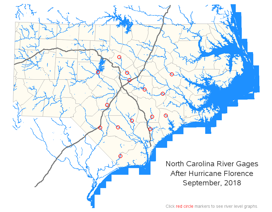
Adding rivers and lakes to the map really helped. But there's one more type of reference point that I wanted to see - roads. It's been in the news a lot that sections of I-40 and I-95 have been closed, therefore I wanted to add them to the map. I downloaded a shapefile containing road data, subset it to just I-40 and I-95, and annotated them onto the map. I had planned to draw lines between the points along the roads, but the points were so dense that I was able to just plot the points themselves without connecting lines.
Now that we know where the river gages are located, the next logical question is "how much flooding did they get?" I could add mouse-over text to the red circles, showing the water level (the current level, the maximum level, etc) ... but a few readings in a mouse-over text just doesn't adequately describe a flooding event. You need a graph showing the water level over a certain period of time.
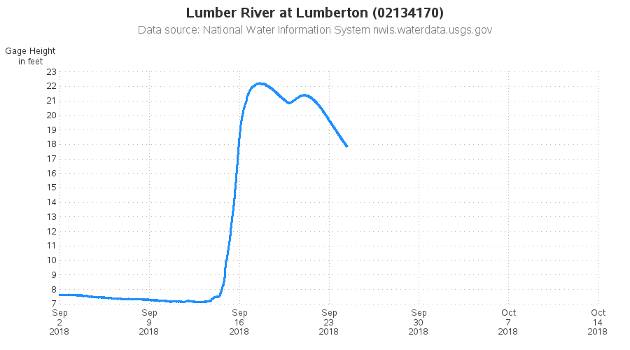
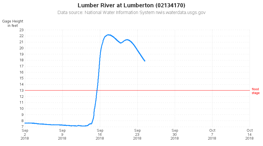
The above graph shows when the water level rose and fell ... but it doesn't communicate one important bit of information - when was the river level above what is considered a flood stage? Therefore I did a bunch of web searching, and added the flood stage to my data (for the gages what had flood stage information available), and annotated a red "flood stage" line to the graph.
I invite you to view my interactive map, and click the red circles to drill-down to the line plots (and click your browser's "back" button to return to the map). Have you seen any of these flooded rivers in person? How long do you think it will take all the rivers and lakes to return to their normal levels?


2 Comments
This was VERY neat. One bit of data that is available here: https://fiman.nc.gov/fiman/ (NC Flood Inundation Mapping and Alert Network) is the volume of water flow (at those gages that record that information). The change in the flow of the Deep @ Moncure was, it appears, quite dramatic. .In early Sept the flow rate was ~ 160 cfs; at its peak the rate was ~ 55.000 cfs and it's now down to about 1000 cfs. (The Cape Fear a bit west of Wilmington at Lock # 1 got to ~ 76,000 cfs). The "Mighty Haw" at Bynum ~ 44k cfs; the Eno @ Hillsboro peaked near 300 CFS.
Thanks!